From looking at my results, I feel as though my music magazine has sucessfully met the guidelines for my target audience. The answers to my questionnaire show that my target audience where interested in my magazine and would be willing to buy it.
Overall, I am pleased with the way my magazine turned out and I think that the genre of music that I was aiming for was well executed.To improve, I would have changed the colour scheme so that the magazine had more of a vibrant and exciting feel to it, as opposed to calm and neutral. It was mentioned that my images create more of a fashion look rather than an Indie genre magazine but I feel as though this gives the magazine a more feminine feel which re-enforces the target audience of teenage girls.
Wednesday, 15 December 2010

Tuesday, 14 December 2010

Sunday, 12 December 2010


Saturday, 11 December 2010


Friday, 10 December 2010

Questionnaire: Results
After collecting back the questionnaires, I am now able to construct tables to show the results and to see as to whether my target audience feel as though my magazine suits them or not.

1. Can you identify the genre of this magazine?

Thursday, 2 December 2010
Audience Feedback
In conclusion to my media studies Music Magazine product, I conducted another questionnaire and sent it out to people within the same target audience as my magazine is intended for. The questions are as follows:
1. Can you identify the genre of this magazine?
2. If so, how?
3. Can you identify a sub-genre of music for this magazine?
4. Who do you think the target audience is for this magazine?
5. Specify one thing you liked most about this magazine.
6. Specify one thing that you disliked about the magazine.
7. Would you be interested in buying this magazine? Why/ why not?
8. Give one suggestion as to how you think the magazine could be improved to become more appealing to its audience.
9. Lastly, did you enjoy reading the double page spread article and interview on the double page spread? Give your reasons why.
Thursday, 25 November 2010
Evaluation 7

Looking at the front covers, it is evident that the preliminary task has large blank spaces which should be filled with tag lines and images. There are no other images on the cover apart from the main image, which I think looks washed out and too dark. The image on the Music Magazine is brighter and looks generally better with the colours chosen and the facial expression of the model. She looks more engaged with eye contact and her facial expression looks more professional and determined. This shows that the photography has improved throughout the projects.
It is obvious from looking at both covers which had the most planning as ‘Belle Melodie’ has the most components and as a whole, looks more interesting to the audience, so they would feel more inclined to read it. The front cover to my music magazine has as many tag lines and images on it as possible so there is no blank space. This makes the magazine look more interesting as a whole as the audience feels as though the magazine is going to be packed with engaging content.
I didn’t include a main feature on my school magazine which I think is essential as it is the first item that is looked for on the magazine. On my music magazine I placed the main feature headline central right as opposed to top left which is where it is usually found. I think that including a main feature cover line gives the reader an impression of what the magazine includes and who the target audience is. The school magazine doesn’t make the audience clear apart from the image of a school girl. This is only clear as she is holder a school folder. Other that that, it isn’t obvious whether the intended audience is male or female. On the other hand, the music magazine makes the target audience clear with the main feature written in pink writing, a feminine colour, showing that the feature and the magazine is orientated around girls. This is also supported by the Polaroid of floral wellies, usually associated with girls, and the main image of a teenage girl.
The journalistic aspect of the magazines has improved throughout as the text on the music magazine has more relation to the audience of the magazine, teenage girls, as opposed to music in general. On the school magazine, the tag lines included are just evolving around school in general instead of focusing around a narrower audience of girls. This shows a lack of planning to see what would appeal to my particular audience than students in general. This also applies to my double page spread. My preliminary page was very basic and there was too much blank space where there should be information. I tried to avoid this problem in my new double page spread for my music magazine by including as much information as possible and leaving minimal blank space to avoid it looking boring.
Monday, 22 November 2010
Evaluation 6

Before media studies I had never used a blogging site before, to track my media product progress I have been blogging on the site ‘Blogspot’. This gave me a chance to give my opinion on existing institutions and well known music magazines such as NME. Blogging helped to show the progress made throughout the production of my magazine and helped to show how I improved it gradually to suit my target audience. Blogspot helps to communicate the meaning behind my pages and how the decisions best suited my audience. Also, it can show the steady development of my components and is a much easier way of showing how I have improved and in what ways such as content or photography skills. In my opinion, I think that it is easier to communicate meaning through pictures and print screens rather than trying to explain it. Blogging gives you the opportunity to do this as show in the print screen above with my reader profile.
To make the components for my magazine I used a black Samsung ES10 digital camera. Once uploaded to the computer I also edited the photos on Windows Photo Gallery to make them look of better quality. I took all pictures myself and edited them myself. With the editing, I mostly enhanced the colours to make the picture look warmer and not cold and washed out. I feel that if the picture are good quality, they make the magazine look appealing to the audience.
Friday, 19 November 2010
Evaluation 5

My target audience evolves around the ‘Indie’ music style which is not as mainstream as other genres which are popular at the present. I chose to have Future Publishing as the institution in which my magazine would be produced by as this company follows a range of topics. In the music category, this company also supports a wide selection of music from many different genres. The name of the institution ‘ Future Publishing’ also suggests to the public that the company is interested in finding new material and bringing out smaller genres of music. I think that the name is appealing and would therefore attract the public more to read the magazine. The section of text listed above shows the types of music that the magazines ‘Future Publishing’ supports. It is evident from looking at the lists that the music style is a wide variety which appeals to my intended audience and the majority of the music isn’t mainstream.
With the various magazines that ‘Future Publishing’ supports, it is clear that this institution is already fully developed but doesn’t follow a specific genre of music with the magazines they support. The ambition of this company is to provide music to a wide range of people from both ends of the spectrum. I think that the company is more likely to be successful as there is a wider target audience with the variety.
Thursday, 18 November 2010
Evaluation 4
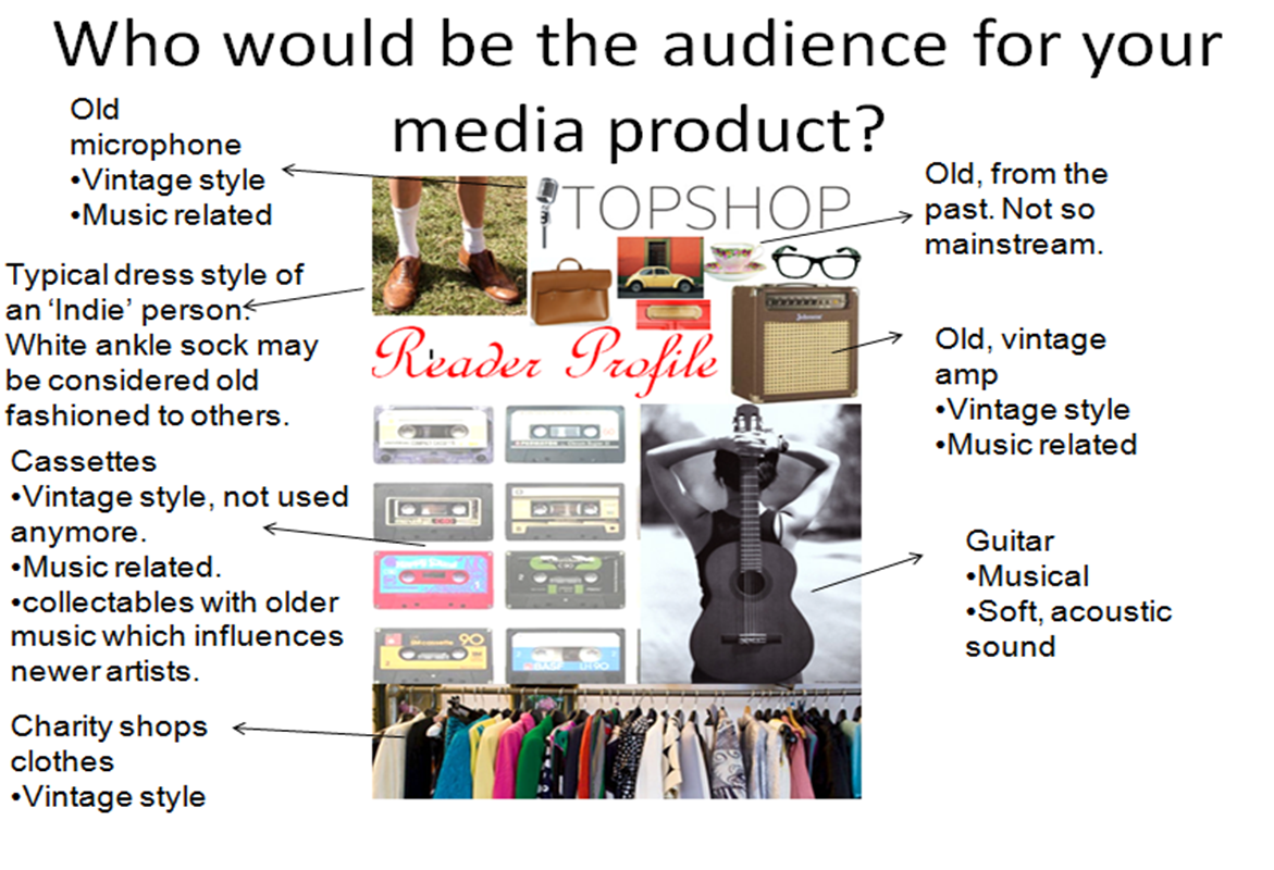
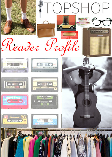
This is my reader profile to show my intended audience for my magazine. From looking at the images, you can see that clothes and accessories are a common occurrence. This suggests that the target audience are girls as this is an interest most common to that gender. The clothes shown are meant to look as if they are from a charity shop, hence why they are on a rail. The ‘Indie’ stereotype is usually based around the theme of vintage, anything from the past in music and style. I added a lot of vintage objects on my reader profile to portray this. Things include an old fashioned microphone, a floral cup and saucer, cassettes and a beetle (the car). All of these items were once very popular and in fashion. They were the thing to have, however times change and these things are no longer the height of fashion. For example, cassettes have been replaced with CDs. Most of the items that I have listed are music related to continue the theme of my music magazine.
From looking at my reader profile, the audience would think that it is quite old fashioned but very music and fashion orientated. This shows that the main audience is girls as they are normally stereotyped to be the gender most interested in fashion and what they look like. This is supported by a picture of a girl with a guitar. The music that I am trying to advertise on my magazine is mostly acoustic which is mostly music which is not as widely talked about. This is the kind of music that isn’t mainstream. To show music on my reader profile I included a guitar which demonstrates the acoustic aspect of music. Also, the old fashioned microphone and amp are to show that even though the music isn’t mainstream, there are people that listen to this type of music and enjoy it.
Tuesday, 16 November 2010
Evaluation 3

My front cover fulfils the majority of the conventions of a front cover to a magazine. Unlike most magazine covers, I chose to put my main sell line on the right hand side of the page as opposed to the top left hand corner, this is where it is usually positioned. This is because the top left hand corner is usually the first place that the reader looks. I changed the position of the sell line as I thought it would make the cover look different as a whole in comparison to others, also, the text is bigger and bolder than the rest of the text which makes it the main focus regardless of its positioning on the page. I think that if the sell line was in the left hand corner, it would cover the model’s face and it would give off the wrong impression. Apart from the main sell line, all the other components are arranged in the expected way for a front cover.
The language used through the magazine is formal in its style as the readers have to be able to understand what is being said. The sell lines on the cover include exclamation marks for emphasis on a point or to show excitement. This makes the page more fun and therefore enticing to purchase. Also, there is a rhetorical question asking whether the reader is ‘Going to a Festival?’ This makes the page much more personal for the reader as it is directed specifically at them. It persuades the potential customers. As well as the used of questions, there are commands to give hints to the reader to go to a certain page. This is used on my contents page. For example, the language used is directly aimed at the reader to get them to do something such as going to a page in the magazine.
The main image on the front cover is typical for a front cover with the space completely covered and eye contact gained to engage the page more with the reader. There is another main image of the contents page which is not typical for this type of page. Usually, there are around six small thumbnails ‘dotted’ around the page to divide the text but on my content’s page, there is one main image at the bottom of the page and then one smaller thumbnail. I chose to make this picture presentation different to the usual layout as it would link to the pictures on the front cover and double page spread with similarities in style. This makes all three pages look smart and presentable which is appreciated by the reader when reading the pages.
Sunday, 14 November 2010
Evaluation 2

From looking at the front cover for ‘Indie’ magazine, ‘Belle Melodie’, it is evident that the magazine is full of exciting, fresh ideas and articles to read. The language used is formal to make it easily understandable by all readers and to encourage people to buy the magazine. The front cover is what the reader sees first when they look at the magazine and it has to make a good impression. By using Standard English in a formal style, the reader sees the magazine as being interesting, easily interpreted and sophisticated.
My intended audience is late teens/ young adults who are interested in ‘indie’ music, meaning anything that isn’t so mainstream compared to other genres of music. Instead, it has a smaller fan base who are more interested in that style of music over other genres in the industry. The ‘Indie’ genre is about individuality and creating sounds that are new and original. The text is well suited to this audience and draws the reader in. The language and topics included show that the main audience for this magazine is females. For example, ‘fashion flaws’ is used and fashion is most commonly associated with women as this is the stereotype that suits. This alliteration is short, sharp and catchy. It catches the reader’s attention. The language used is also very engaging with the readers. The use of rhetorical questions and informative text makes the reader question themselves about it. ‘Going to a festival?’ This question is personal and pulls the reader in as they answer the question. This is also made very direct with the use of pronouns such as ‘you’ as it is a direct referral to the person reader it.
As well as the persuasive techniques, the colours help the writing to stand out for the reader. Certain words stand out more than others which create a summary of the magazine as a whole. Words include ‘bigger, better, festival, chart, update, sound, now.’ This suggests to the reader that this a music magazine and contains the most up-to-date and recent information about music.
Lastly, the main image has the most significant affect on the reader. This determines whether the reader will pick the magazine up or not. The model in the picture is making eye contact, this makes the magazine seems more appealing as they are engaging with you. The overall look of the model also gives the reader an outline as to what kind of music the magazine focuses on and what style there is. In this case, the model is dressed in a very simple manor but looks smart, sophisticated and determined with her facial expression. This is welcoming to readers.
Wednesday, 10 November 2010
Evaluation

My magazine product is orientated towards ‘Indie’ stereotype and music, the images on my double page spread are all of my artist by themselves. This is reinforcing the fact that my artist is very much independent in what she does and has become successful through this. This proves individuality, which is commonly associated with the ‘Indie’ genre in the sense that its is all about ‘standing out from the crowd and producing something new that the audience is not used to. This indicates that the sound of the music produced has to be individual and not mainstream. Her facial expressions are fixed and concentrated, indicating that the artist is determined in her career, she is looking ahead and hoping to succeed in her career. My magazine is aimed at someone who likes individuality, who wants to do well and is willing to put the hard work and effort in to do this. The artist looks calm and contented in her appearance, which also demonstrates her style of music. It is soft and easy to listen to.
The readers of this article are intended to be ‘festival goers’. This is made clear in the article by the mention of a tour and upcoming concerts for which tickets are available to buy. This is also supported by a small subheading about what to wear to a festival and a picture of wellies, traditionally worn to festivals. It is mentioned in my double page spread that my artist has played at festivals and is planning a tour. This proves to the reader that this magazine shows interest in festivals and offers them to the reader, therefore they should be fans of this. A young audience is indicated by this as the majority of young people are willing to pay to go and see their favourite singers or bands live. Also, the small icon of coloured wellies suggests a young teen/adult audience as this is something that they would wear. This makes the intended audience clear.
The double page spread interview and review on the featured artist, Lily Andrews’ includes significant information about her career at present, where she stands amongst other artists and what she plans to do in the future. She is represented as a successful artist, keeping all fans fans and general readers up to date with the progress she is making in her career as a singer/songwriter. This is clearly stated as a subheading on the article, referring to Lily as ‘Singing Sensation’. She successfully delivers in a difficult industry as demonstrated by the statistics following her great success.
This represents my artist and general singers of the ‘Indie’ genre that this style of music is successful despite not being as mainstream as other types. Therefore, before the reader has even looked at the article, they are well aware of her profession. There are continuous reminders about her position in the charts with her new single, the release of a new album, music video, tour and a clothes line. With these constant reminders, the reader is fully informed of her success. Following on from her success, the reader is able to see that as a singer, Lily Andrews is established and has made her mark in the industry. She looks fashionable, fresh and sophisticated in her pictures which gives a good impression to the reader as she is new and independent. The artist is following the genre of ‘Indie’ music and creating her own style which the pictures demonstrate.
Friday, 5 November 2010


Monday, 25 October 2010
Front cover: Second Draft

This is the second draft of my Front Cover. I changed that background image to another that seemed more appropriate to the genre of music that this magazine is aimed at. I still feel as though the image is engaging and encourages the audience to read the magazine and the eye contact is more inviting. More tag lines have been added to make the cover seem more 'busy' and exciting. In comparison to the previous draft I feel as though this cover is a vast improvement and the main topic being the artist 'Lily Andrews' is evident.
Wednesday, 20 October 2010
Front cover: First Draft

This is the first draft of my Front Cover. I feel as though the image is engaging with the reader and suited the genre in that it showed independence and something different when compared to the mainstream image of artists. I think that the masthead is easier recognisable and would stand out well for marketing purposes.
Saturday, 16 October 2010
Computer Mock Ups

This is a rough idea of how the front cover of my magazine will be laid out. I would like to have an image of a solo artist (a girl). There will be sub lines surrounding the image with little space around the edges. There will be consistant colour scheme.


Thursday, 14 October 2010
Reader Profile
This is my reader profile to show my intended audience for my magazine. From looking at the images, you can see that clothes and accessories are a common occurance. This suggests that the target audience are girls as this is an interest most common to that gender. My magazine is going to support an 'indie' style of music.
Definition of 'Indie'
Overall, Indie music and style in general isn't mainstream or well heard of. The music is a mix of pop and rock but without the aggression of the rock. It also contains acoustic and light percussion.
From looking at the dates, Indie style of music and culture is old fashioned but vintage. Which has become fashionable. An aspect of vintage has been shown in my reader profile with the rack of clothes from a charity shop, cassetes and an old fashioned microphone.
In my magazine, I want the style to look different from usual magazines, with a vintage twist on it. For example, there will be a solo artist and she will be dressed in vintage clothing. This will also match the colour scheme of the magazine.


Tuesday, 12 October 2010
Questionnaire
What would you call a music magazine for an Indie genre for 16 +?
…………………………………………………………………………………………………………………………………………………………….
What gender would you like to see on the front cover?
Male
Female
I don’t mind
Would you like to see a group or a soloist on the front cover?
A group
A soloist
I don’t mind
How much would you be willing to pay for the magazine?
50p
75p
£1
£1.50
I don’t mind
If other, please state below:
………………………………………………………………………………………………………………………………………………..............
Pick 3 colours you would like to see as part of the colour scheme for a magazine:
.............................................
……………………………………………
……………………………………………
Would you like the features to be a mixture of contemporary and vintage?
Contemporary
Vintage
Both
I don’t mind
Neither, if so please state below:
…………………………………………………………………………………………………………………………………………………………….
What do you not want to be featured?
………………………………………………………………………………………………………………………………………………………………………………………………………………………………………………………………………………………………………………………….
Sunday, 10 October 2010
What am I aiming to achieve on my front cover and what will it include?
- Big, bold and recognisable masthead.
- Clear sub text to engage reader.
- The background image has to be focused: no blurring or pixilation
- The magazine has to show who my target audience is: 16-18 year old girls with an "indie" taste in music (acoustic mainly).
- Definite colour scheme.. makes it look more professional and neat.
- Appropriate information visible such as price, date of issue, bar code.
- Ratings? reviews?
- variation in text used.
- Overall look: smart, professional, sophisticated, modern.
Thursday, 7 October 2010
Research Media Texts: Existing Double Page Spreads


These examples of double page spreads show how there is one main topic which is focussed on. There is usually a main image of this person/ people and then smaller additional images which are scattered around. The examples above that I have selected don't show this, however I think that smaller images break up the text and make it seem like less, therefore the reader is more encouraged to read it. Also, the masthead to the page should make it clear to the reader what the topic is and the style of this should express something about their personality. For example, pink and curly writing would suggest a girly and very feminine person.
Wednesday, 6 October 2010
Research Media Texts: Existing Contents Page


These contents pages show a variety in the way in which the page can be set out to be effective for their audience. From looking at these pages, I feel as though a balance between pictures and text would be ideal for my contents page. I think that the last example for the Kerrang! magazine has too many images and I think that more text would suit better. In comparison to this, the other two examples have more text compared to images. Overall, the text:images depends on your target audience. My target audience is young adults and therefore I intend to have a balance of both, whereas a magazine for older people would have more images to make the page more understandable.
Saturday, 2 October 2010
Research Media Texts: Existing Front Covers


These examples of music magazine covers from Q and NME magazines both demonstrate the style in which I would like to incorporate into my own magazine. The main image is very sharp and engages the audience with the main image dominating the page.
The mastheads on all of these magazines are bold and recognisable. This is important for advertising as the mastheads need to be able to be noticed easily on the page as this is the part that sells the magazine, it is the brand. From looking at these covers, I would like to ensure that my image is dominant on the page and the main focus, that the brand name (masthead) of my magazine is easily recognisable and that the magazine looks 'busy' with tag lines and other smaller images.
There is a distinctive colour scheme in all of the covers. For example, NME magazine has a memorable red font for the masthead. This also applies to the Q magazine with a definite red, white and black scheme.
Final Preliminary Task: Cover

This is the final cover of my preliminary task for a school magazine. Overall I am pleased with this cover as I feel as though it has engaging tag lines which are easily understandable. Also, the eye contact gained from the model used is more encouraging for the reader.
To improve I would add more text to make the page seem more full and packed as opposed to empty and lacking interest.
Thursday, 30 September 2010
Reader Profile: Who is my School Magazine aimed at?
Age: 16
Gender: Female
Subjects: Performing arts, (dance and drama)
Key Stage: 5
Attitude to learning: Has fun with friends, very popular, but still works hard.
Hangout: Shake shed, Topshop, Boot Fairs, Charity Shops, the beach, the park.
Get to school: get the bus with friends.
Music tastes: open to listen to anything
Likes: Hanging out with friends, singing, going shopping, vintage clothes, all music, facebook, twitter, films, duvet days, big cardigans, long hair.
Dislikes: Chavs, tracksuits, high school musical, loads of jewellery and make-up.
Clothing: Big cardigans, skirts. Charity shops and boot fairs.
Star sign: Cancer
Weekend: Work and homework, go out in the evenings when possible with friends, sleepovers.
Career choices: Something with children.
Shepway? Local?: Romney Marsh area.
Sandwiches or school dinners?: mix of both.
Popular? : Has a wide variety of friends.
Name/stereotype: Indie kid.
Preliminary Task: School magazine
For our Preliminary task, we designed a front cover for a school magazine. The magazine was to appeal to all ages thoughout the school and to offer help and advice to students. My first draft was very basic with limited text on the cover but i felt as though the background image was effective and engaged with the audience.


My first draft had too much blank space where there should be more headings and text to make the magazine stand out. I feel as though the eye contact made by the model in the picture helps to make the magazine more welcoming and engaging. Also, the model is dressed in basic black clothing so all attention is not focussed on them.

This is the second and final draft of my school magaazine cover. I feel as though the space as been filled better and improved since the last draft. However, there is still blank space making it seem empty. If I were to re-do this piece again I would add more taglines to make it look more busy and exciting.
I think that with the model holding the folder, it certifes to the reader that it is a school magazine and the name 'Paige' links in well. It is a pun in that fact that it is a girls name, aiming it at the target audience of girls and Paige meaning a page in a book: relating to school work.
Wednesday, 15 September 2010
Conventions for a school/college magazine
o Clear layout: to make the article look sophisticated and presentable.
o Good quality picture/photos: not blurred or pixelated.
o Inviting: the front cover has to look ‘welcoming’ to the reader to encourage them to read on.
o Informative: has to include certain information such as term dates and upcoming events.
o A recognisable and unique magazine name.
o Continuous colour scheme: possibly matching the colours of the school uniform, unify.
o Readable: all text on the cover has to be easily noticeable and of a reasonable size.
o Suitability of text for age groups: relevant topics suiting all ages.
o Continuous theme.
o All content should be relevant to the main topic of the school/college.
o No blank spaces, as much information displayed as possible.
o Some humour to break up the information.
o Appeal to target audience.
o Fresh news/ information: keeps the readers engaged.
Subscribe to:
Posts (Atom)