Looking at the front covers, it is evident that the preliminary task has large blank spaces which should be filled with tag lines and images. There are no other images on the cover apart from the main image, which I think looks washed out and too dark. The image on the Music Magazine is brighter and looks generally better with the colours chosen and the facial expression of the model. She looks more engaged with eye contact and her facial expression looks more professional and determined. This shows that the photography has improved throughout the projects.
It is obvious from looking at both covers which had the most planning as ‘Belle Melodie’ has the most components and as a whole, looks more interesting to the audience, so they would feel more inclined to read it. The front cover to my music magazine has as many tag lines and images on it as possible so there is no blank space. This makes the magazine look more interesting as a whole as the audience feels as though the magazine is going to be packed with engaging content.
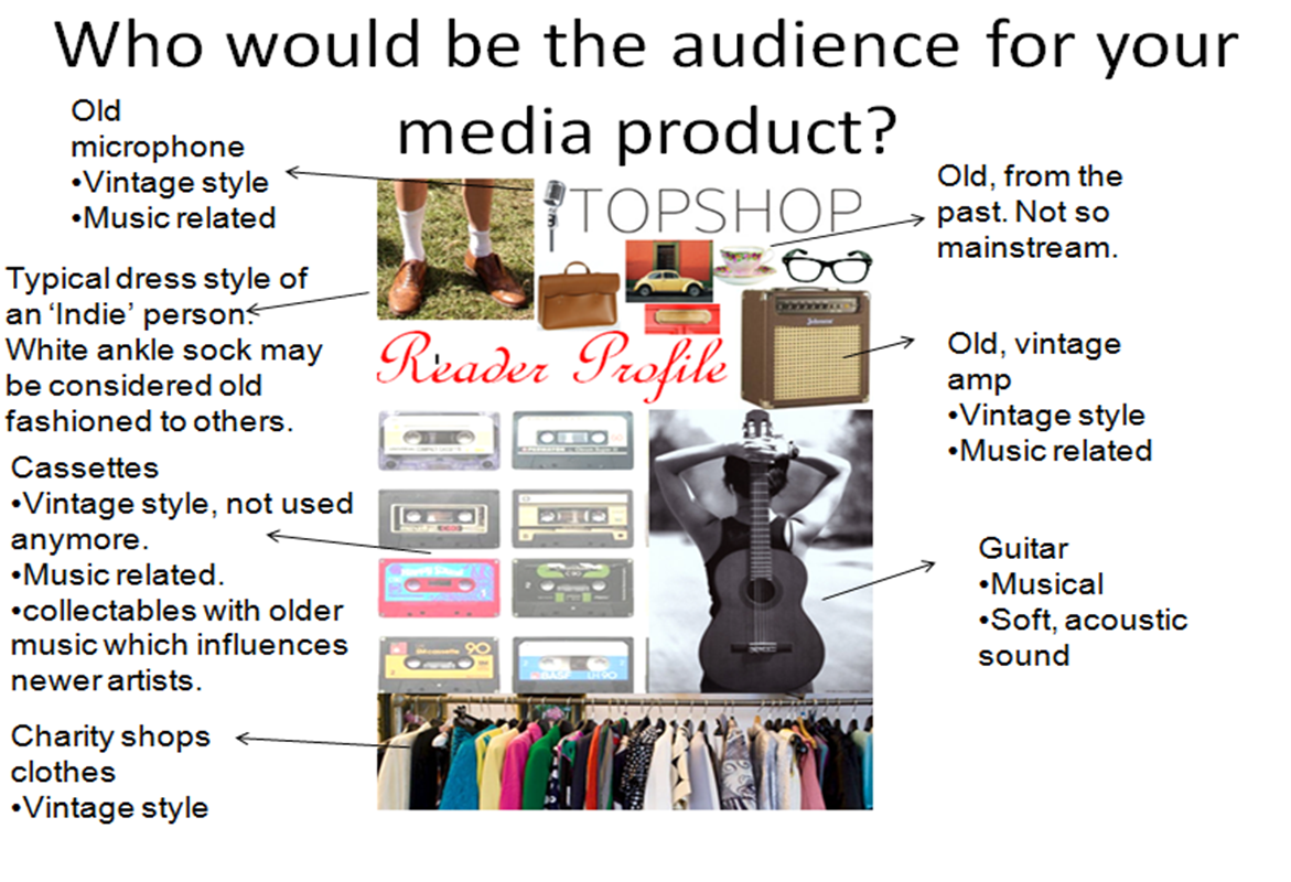
I didn’t include a main feature on my school magazine which I think is essential as it is the first item that is looked for on the magazine. On my music magazine I placed the main feature headline central right as opposed to top left which is where it is usually found. I think that including a main feature cover line gives the reader an impression of what the magazine includes and who the target audience is. The school magazine doesn’t make the audience clear apart from the image of a school girl. This is only clear as she is holder a school folder. Other that that, it isn’t obvious whether the intended audience is male or female. On the other hand, the music magazine makes the target audience clear with the main feature written in pink writing, a feminine colour, showing that the feature and the magazine is orientated around girls. This is also supported by the Polaroid of floral wellies, usually associated with girls, and the main image of a teenage girl.
The journalistic aspect of the magazines has improved throughout as the text on the music magazine has more relation to the audience of the magazine, teenage girls, as opposed to music in general. On the school magazine, the tag lines included are just evolving around school in general instead of focusing around a narrower audience of girls. This shows a lack of planning to see what would appeal to my particular audience than students in general. This also applies to my double page spread. My preliminary page was very basic and there was too much blank space where there should be information. I tried to avoid this problem in my new double page spread for my music magazine by including as much information as possible and leaving minimal blank space to avoid it looking boring.